I recently read the July08 Toastmaster magazine and an article on "Giving Effective Financial Presentations with Powerpoint" attracted me. I like to share with you what I had learnt. Perhaps you can use one or two points if there is a need.
1) The story in your presentation
* Know what story you are trying to get across and skip anything that distract from that story.
* It may be a story of a new company with promising growth or a story about meeting market challenges, etc
* Tell your story with Simplicity and Clarity
2) Limit the amount of Infomation on each slide
* Do not show a slide with more than 4-6 columns and 6-8 rows
* Audiences cannot read or retain complex information from slides
* Detailed financial reports can be given as separate handouts to audiences for them to refer
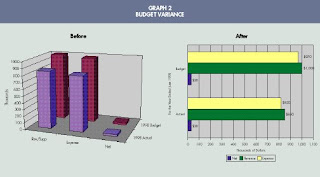
3) Use Charts Effectively
* Charts can explain a thousand words and audience will be focused on it
* Pie charts can show how an investment allocations are changing
* Bar charts can compare and line charts can show trends, etc
4) Use a readable font and font size
* Tahoma, Verdana or Goudy are good to use for screen viewing
* Keep it simple. Avoid using Blocky fonts, Wordarts and animations. It can make your presentation amateurish.
* Font size of probably 32 and above are recommended
5) Use appropriate slide transitions
* Some transitions like wagon wheels and venetian blinds can be distracting
* Use just 1 simple transition like a left-to-right wipe and stick to it
6) Choose high contrast background and colours
* Black or dark blue background with white or light yellow text are classic
* White background with a dark text is okay too.
* For the former, you may need to dim the lights for audience and for the latter, you can present in a brighter room.
* Darker rooms can make a person fall asleep
7) Use of blank or black screen between illustrated points
* If you want the audience to focus back onto you, introduce a black screen
* Audience will not be distracted by the next slide or keep staring on the previous slide
8) Check for unintended colour combination or symbols
* Unless you are presenting for a doll company, don't use colour like pink or being too colourful.
* Can use symbols in the slide to attract attention into important areas. Eg, a hexagon "STOP" symbol in the centre of the screen.
9) Provide useful handouts
* 2 to 4 slides per page is ok
* More detailed information that cannot be projected can be given out to audiences as reference
10) Get to the point
* Remember that your audiences are busy and intelligent. Make your point and know when to quit and let them read the handouts themselves.

No comments:
Post a Comment